Why You Should Just Start Writing Already

There’s this fear among new writers that they just aren’t good enough to write the books they have ideas for.

Some want to start with short stories to ease into writing. And if that helps you, go for it. But short stories are a different skill set altogether.

But for most, it isn’t that short stories are the best introduction to writing. It’s just fear.

And I get it.

Writing a book is a daunting task.

But here’s why you should just write the book already.

You have to start somewhere.

If you never start, you’ll never finish. That book will not write itself, believe it or not.

And all the intricate subplots and character arcs that make the book “too complex for a new writer” might fade from memory before you ever actually sit down to write.

And let’s face it, you won’t get better if you don’t practice.

That story idea might be the least complicated story you ever come up with, and it may be the perfect way to practice for the more complex ones that come later.

Some writers say that you don’t get good until about… ten books in.

Because you haven’t practiced enough yet.

That doesn’t mean the first book will be hopeless.

Editing and rewriting are major parts of writing a book. Everyone’s first draft sucks, and the part that comes after writing the rough draft actually takes far longer.

But that’s the part that helps you learn.

Critique partners, alpha readers, and beta readers can help point out your strengths and weaknesses, that way you know what you actually need to work on.

Then, you do more editing.

And more.

And more.

Then, you enlist a professional editor, and they show you what you’ve missed.

So, your current skill level is not the skill level you’ll finish your book at. You’ll grow and get better, and by the time your book is done (not just written, but done), it’ll be what you want it to be, regardless of your current skills.

But you have to start writing.

Because that’s how you’ll improve and more importantly, how you’ll find your voice, the thing that keeps people coming back to your books again and again.


Want to fund this blog and my writing efforts? You can support me directly here.

Check out my gritty, literary sci-fi and fantasy books here.

Subscribe for sneak peeks and updates on my upcoming books (and get a free short story).

An Indie Author’s Guide to Repackaging a Book

One of the brilliant things about being an indie author is that you can repackage your book whenever you need to. Covers, trim sizes, fonts, whatever you want to change, you can change it.

Traditional publishers do this for you, or without you, picking and choosing the cover (sometimes consulting you on the matter).

But for an indie, repackaging a book means a lot of work.

So, how do you know if you need to do it?

Without a team of experts in a big time publishing company to make the decision to repackage a book, it can be hard to tell. So today, we’re covering a few circumstances wherein you might benefit from repackaging your book, starting with the most dire circumstances.

Unprofessional

If your book cover does not look professional, something reviewers and bloggers will likely point out, you NEED to repackage your book.

Your cover is the most important piece of marketing material you have. It’s everywhere that your book is. It’s in all your promotional material.

If it looks like it was whipped up in a matter of minutes by someone with no clue as to what they’re doing, it will turn readers away.

Your cover doesn’t match your genre

It’s important to stand out from other books. But your cover should lend itself to your genre.

If your book is a cozy mystery but the cover looks more like a fantasy romance, first of all, how? Second, you’ll be drawing in the wrong types of readers.

People who would be interested in your book likely won’t give it a second glance, whereas the people drawn in by the fantasy cover will turn away after reading the blurb.

It has nothing to do with the story

Your cover needs to reflect the type of story the book contains. And this goes beyond genre. This gets into subgenres and tropes.

Magical orbs fit fantasy, but they should not appear on the cover of a low fantasy book (fantasy minus magic).

A sci-fi novel without a single romance subplot shouldn’t have a couple on the cover about to kiss or a topless dude posing for the camera. Those things draw in romance readers looking for at least a subplot of love.

Which might lead to disappointment once they start reading and find none in the book.

Now, on to the less dire circumstances that might require a book to be repackaged.

Branding

Whether you’re going for a consistent art style, color palette, or font choices, branding is important. It lets readers know that a book is yours before they ever see your name on it.

If they recognize your style on the cover and they know they can trust you, trust your work, that’s an easier sale.

If you’re redoing your brand (or just realizing that branding can apply to book covers), this is a good reason to pick out a new cover.

It isn’t make or break. It won’t destroy your career if your book covers don’t all match in some way. But having them look cohesive can help.

This is especially important in series. Outside of a series, it could just be a tendency toward a specific color palette and the use of a certain font for your author name.

New Edition

If you’ve added a significant amount of content to your book, enough to constitute a new edition, then a new cover could help readers differentiate between the two.

Book birthday celebration

If your book has reached its first birthday, maybe celebrate with a shiny new cover?

I’ve done this for most of mine, updating the covers as a celebration and to keep up with current genre tendencies.

Special edition/Limited edition

If you want to generate a bit of buzz and have a backup cover that you didn’t use, there’s always the option of running that cover for a little while as a special edition/limited edition.

Just keep in mind that if a seller has already ordered a few copies, they’ll ship those out first before ordering any copies with the new cover. A workaround for this is to set up a different book altogether, with a separate ISBN, to sell the limited edition cover copies.

Now, there are other times to change covers. This is not a comprehensive list, by any means. But keep in mind that you should do so strategically. Changing the cover every other week could drive your readers bonkers.

But doing so every now and then provides you with an opportunity to bring your book back out into the public eye. It’s an event, just like the original cover reveal.


Check out my series on making book covers the right way. Part One, Two, and Three.


Want to fund this blog and my writing efforts? You can support me directly here.

Check out my gritty, literary sci-fi and fantasy books here.

Subscribe for sneak peeks and updates on my upcoming books (and get a free short story).

A Guide to the ARC Reader Process: Part One

ARCs are a vital part of any book launch, providing a little boost during release week. But what are ARCs? Why are they important? And what do you do with them?

ARC means Advanced Reader Copy. It’s a copy of your book that you send out to reviewers or avid readers for free before the book comes out in exchange for an honest review on or before release day.

These can be print copies or ebooks, but there are obvious logistical benefits to ebook. First of all, you can send ebooks for free. Shipping books, even going media mail and risking late delivery, gets expensive real fast. Some of the bigger bookstagrammers prefer hard copies because they photograph better, but we’ll get there later.

Is this whole process a gamble? Yes.

Not every ARC reader honors their promise to leave a review.

And the ones who do aren’t guaranteed to love it. This does mean there’s a chance the reviews that go up could be bad reviews. (Hence the stress on the word honest up above.)

But ironically enough, even bad reviews get your book noticed in the eyes of the almighty algorithm.

Why does that matter?

When your book gets enough reviews (I’ll be honest, I don’t know the magic number. I’ve heard 10, I’ve heard 20, and I’ve heard 50), Amazon will start recommending it.

Without any extra effort from you.

As in… FREE promotion of your book.

So obviously, reviews are important, whether they’re good, bad, or neutral.

And since some readers prefer to read 3, 2, or 1 star reviews (so they can see what they’re really in for and decide if they can stomach the bad in the name of the good), they could actually serve you well.

Some readers find books they love after seeing a 1 star review complaining about the presence of a certain trope within the book, a certain trope that happens to be that second reader’s favorite.

Now what do you do with ARCs?

First of all, you should make sure your book is ready for this step. All major edits should be done. ARC readers are not beta readers. They shouldn’t find plot holes for you to patch up after the fact. That would basically invalidate their review.

Exception: If the book is still with your editor for proofreading (aka some typos remain), that’s okay. Just make a note at the beginning of the ARC so they know to expect a typo or two.

But everything else needs to be done.

That includes interior formatting and the cover design. This needs to feel professional and finished.

Now, take a week and make sure your book is truly ready for this step. Come back next Monday for some tips and resources to help you find appropriate ARC readers to help you launch your book.

P.S.- If you’ve signed on with a traditional publisher, chances are, they’ll handle all of this for you. Indie authors, you have some work ahead of you.


Check out my gritty, literary sci-fi and fantasy books here.

Want to fund this blog and my writing efforts? You can support me directly here.

Subscribe for sneak peeks and updates on my upcoming books (and get a free short story).

My Three Favorite Tropes and How to Write Them

Of all the tropes out there, I love strong female leads (with trauma), underdogs, and slow burn romance above all others. I write one or all of them into nearly every one of my own books and love when I find them in books that I’m reading.

And in the interest of seeing them done well, today I’m offering up tips on how to write them well.

Shall we start with one that’s become increasingly popular of late?

Strong female leads who have a history of trauma

Plot-relevant trauma
If your MC has a tragic backstory, it needs to make sense. Trauma for the sake of trauma (or for the sake of clamoring to be relatable) probably won’t come across well. If her struggles are relevant to the plot or a sub-plot, the story will feel more natural.

There are many kinds of strength
Remember that bold, reckless, and in your face is not the only kind of strength. As human beings, women have the ability to possess many different types of strength. They don’t have to be rude or bitchy. There are much quieter types of strength.
Yes, fire is hot and fierce, but stone is sturdy and unyielding. Yes, resolve and a go-getter attitude is strong, but so is the ability to be compassionate under duress.

Underdogs

Give us a reason to root for them
Don’t just throw a two-dimensional character up against insurmountable odds. Give them emotion. Give them heart. Give them something compelling to fight for so that we want to see them succeed.

Give them at least some chance
The key to a good underdog is them coming out on top, besting their foe. But if the means by which they accomplish this are completely unbelievable, the story will fall apart. Give them difficult odds, not 100% impossible.

Slow Burn

Chemistry
Build these characters into people who would actually fall for each other. Give them inside jokes. Fill their time together with fleeting glances and the excitement of wondering if the other person meant to brush their arm. Give them butterflies and heat.

A compelling reason for them not to tear into each other immediately
Give them all that chemistry… and then give them a compelling reason for staying apart at first. Maybe one of them is healing from betrayal and isn’t sure they can trust what they *think* the other person is feeling. Maybe one of them has a history of being a player, and the other doubts them. Maybe one is about to move across the country, and they weren’t looking for anything serious.
Just make sure it’s a good reason, that way it frustrates them and gets your reader really hoping they can overcome it.

Keep reading. Keep writing.

Later.

Check out my books here and fill your heart with all the aforementioned tropes. Subscribe for sneak peeks and updates on my upcoming books. Or if you’d rather pitch in for editing and other writing-related expenses, you can support me directly here.

A Busy Writer’s Guide to Time Management

For the vast majority of writers, day jobs are an unfortunate necessity. Many struggle to find the time to write. I’ve done a post about the necessity of actually making time for our books before (read it here), so today, I’m coming at you with tips to help you fit writing in.

1. Make it a priority.

If you take your writing seriously, those closest to you are more likely to respect your writing time. Of course, that doesn’t always mean boundless support. Sometimes, it just means they don’t put your writing down as a silly hobby.

But if you treat your writing as if it doesn’t matter, so will they.

2. Pay attention to your day-to-day schedule.

By that, I mean that you should look at what your days usually consist of and see where you have a few minutes to yourself. That’s your window.

The middle of the night works best for me. I typically write somewhere between midnight and five in the morning. That isn’t ideal for most, but with the schedule my day job keeps (I work in a factory, so my hours aren’t exactly typical), that’s what works best for me.

3. Remember that even just a few minutes at a time can make a difference.

You don’t have to carve out hours and hours of time. For most, that isn’t always a possibility. Even just five or ten minutes here, twenty minutes there will add up to a whole book as long as you stick with it.

4. Carry a notebook or get a notepad app on your phone.

You never know when inspiration might strike, or when you might find yourself with unexpected down time (waiting room at the dentist, getting an oil change, etc.). That’s a perfect opportunity to write.

5. Cut back on TV, gaming, or scrolling through social media.

Everyone’s least favorite tip, I know. But it helps. Instead of binging a new show for hours on end or getting sucked into TikTok, write. Plain and simple.

If you really want a show on, turn the TV on to a show you’ve seen before but still love. That way, you know you won’t miss anything, but still have background noise and something to clear your head if you get stuck with your writing.

6. When you sit down to write, actually write.

Don’t sit at your computer playing on Facebook or checking emails. Set aside time for that when you aren’t supposed to be writing. If you just can’t resist, put your computer in airplane mode and set your phone in a different room.

Now, shouldn’t you be working on your book?

Keep reading. Keep writing.

Later.

Subscribe to stay up to date on all my upcoming books. Check out my published books here. Or if you’d rather support me directly, you can buy me a coffee.

12 Hard Truths for New Writers

We all have our own idea of what a writer’s life is like. Whether it’s teapots and typewriters or coffee shops and laptops, rich and glamorous or starving artist, there are these images we have built up in our mind.

Regardless of what your preconceived notion of a writer’s life may be, there are a few universal truths.

So, if you want the wool pulled off your eyes, if you want to know the reality (rather than the expectation), here are a few hard truths that are better swallowed sooner rather than later.

Writing the book is often the easy part.
When you’re writing, you don’t have to worry about getting it perfect, and that alleviates some of the pressure that comes with later stages. (Yep, there are a lot of later stages.)

Writing isn’t always easy, though.
It isn’t all rainbows and magical typing sprees where your fingers magically compose thousands and thousands of words in a single session. It takes work, time, and dedication to go the distance.

No one is going to write your book for you.
At least, not unless you pay them. Ghost writers exist, but they do charge for their time and creative abilities. (As they should.)

Editing can be absolutely brutal.
You may end up scrapping scenes, chapters, or even entire characters. Getting feedback can be rather painful. But it’s necessary.

Editing can be immensely rewarding.
Figuring out the exact detail that fixes a plot hole can be a major high. Getting feedback can be unbelievably encouraging.

Traditional vs. indie is a big decision that should not be taken lightly.
Every author has different abilities and goals. As such, every author needs to consider their own strengths and weaknesses honestly when choosing their publishing route.
Just remember, you should never pay a publisher hundreds or thousands of dollars to publish your book. That’s a vanity press, and it’s a legal scam profiting off of authors who don’t know better. I made that mistake six and a half years ago. You don’t want to do it.

There are tons of resources to help you choose the right path for you.
From AuthorTube to the writing community on Instagram to writing groups on Facebook, there are millions of writers out there debating the same thing or actively pursuing one or the other.
Ask around. Most authors are more than willing to share what they know on the subject. Just keep in mind that your skill set is likely different from theirs. You should consider their experience in light of your skills and goals.

There will always be someone who doesn’t like your work.
Every person out there is different. Writing is in fact an artform, and thus, it’s subjective. The odds of everyone absolutely loving your book are… well… low. Really low. That doesn’t mean your book is bad or that you shouldn’t write it because…

There will always be someone who loves your work.
Since writing is such a subjective thing, there is an audience for every book. You just have to find it.

Marketing can be an absolute beast.
Between figuring out the best social media platform for you and your book and putting together compelling ads that convince people that they want to give you money and take a risk on your book by investing hours of their life into something they may or may not like, marketing is a beast that can be hard to tame.

There are a lot of classes tailored specifically for helping writers learn how to market their books.
Skillshare, Inkers Con, and a million writing coaches are out there waiting to show you the ropes. Just be sure to shop around to see what classes work for you and your budget.

There is no feeling quite like holding your book in your hands.
Holding a world that you’ve created, flipping through page after page that you’ve filled with characters and places that didn’t exist before is an absolute dream. It’s exhilarating.
And it makes all the difficult parts of being a writer 100% worth it.

So keep going.

Keep writing. Keep reading.

Later.

Subscribe to stay up to date on all my writing projects. Check out my published books. Or if you’d rather support me directly, you can buy me a coffee.

Crying while writing: Is it a good sign?

Many writers wonder if they’re silly for crying over their own book. After all, we’re the ones writing it. We should be hardened against the tragedies we throw at our characters.

Right?

Eh… not quite.

You see, as writers, we have to get to know our characters. We spend months or years in their heads, going on adventures with them. We learn about them and in a way, befriend them.

So, when they suffer… we suffer.

Not to mention the potentially cathartic nature of writing.

I don’t know about you, but often times, if I’m struggling with a specific emotion or event in my life, there’s a chance that at least one of my characters is going to face something similar. It won’t be exact, of course. It’ll be fictionalized and adjusted to fit their life.

But it’s there.

And getting it onto the page helps me work through it myself.

So, when they cry about something similar to what I’m going through, sympathy kicks in, and I’m pretty likely to cry.

It helps to get things out and see them through someone else’s perspective. It lends the situation a halfway objective nature.

And of course, there’s this…

“No tears in the writer, no tears in the reader.”- Robert Frost

If a scene you write hurts you, if you knew it was coming or if it snuck up on you, then it’s a pretty good indicator that the emotion is there. And if the emotion is there, then there’s a much better chance that your reader will feel it.

And don’t we want our readers to feel the things happening in our books? To relate and emote?

So don’t feel silly if you cry while you’re writing.

It may actually mean you’re doing a better job than you think.

And even if it doesn’t mean that, you’re certainly not alone. I cry while writing, all the time.

So keep going. Rip your heart out and put it on the page.

Keep reading. Keep writing.

Later.

Subscribe for sneak peeks, behind the scenes looks, and exclusive content. Read books that just might tear your heart to shreds.

How to Design a Book Cover: Part Three, Design Basics

Now that you have some basic knowledge of typography and some resources to pick and choose images from, lets talk about the art itself.

There are a lot of things that come into play when creating art, and the rules and practices change depending on the medium and the style you’re working within. There’s a reason it takes many people years of study to become proficient in any artform.

Today, we’re going to cover a few basics. But first, the most important thing to remember is that your cover needs to do a couple very specific things. It needs to get (good) attention, it needs to convey something about your book, and it needs to fit the genre of your book.

So, with those things in mind, here are some things to remember while selecting artwork:

Composition

A good composition will have a defined focal point. You don’t want your cover to have so much going on that it loses all focus. Then, you run the risk of confusing readers or just flat out scaring them away.

You can use leading lines to direct the viewer’s eyes to certain areas of the cover. These can be a sword or a sweep of hair or a lifted arm. You can use these leading lines to show the viewer around the cover or direct them to the focal point.

Odd numbers of items/people and ‘S’ curves are very appealing in compositions.

Color scheme

Do you need a color scheme? Yes.

Your cover should be cohesive. If you have clashing colors and no discernible reason for those colors to be there, you’ll only scare readers away.

Pick a few colors that work together and stick with them.

Eye-catching

The entire point of a cover is to draw readers in. Thus, it needs to catch their eye.

You don’t need a massive landscape shrunk to fit on the cover. You don’t have to have explosions and boobs.

You need something that is aesthetically pleasing, something that stands out.

Genre appropriate

And yet, your cover needs to fit in.

Every genre has trends. Sometimes it’s okay to break from trends, but they do happen for a reason. They show what readers expect from that genre and helps a reader easily identify what kind of book they’re looking at.

Study other books in your genre to get ideas of the current trends.

Relevancy

Your cover should tell potential readers something about your book specifically so they have an idea of what they’re getting into.

If you have a dragon on your cover, they know to expect a dragon in the story. If you have a sword and some magical effects, they know to expect a sword and sorcery type book.

If your cover has a bloody knife on the beach, they know to expect a summer murder story.

Make sure your story gives a hint at what they’ll find within the pages. Just don’t beat yourself up trying to get the whole story onto the cover. Again, you don’t want the cover to become overwhelming or confusing.

Lighting

If you’re combining different images, you need to make sure the lighting is the same in each one. The images will have their own light sources within them, coming from their own directions.

You need to flip the various elements to align these light sources, otherwise you might end up with a character whose boobs are lit from one direction, the highlights on their wings are on the wrong side, and their shadow goes a completely different direction.

And that just doesn’t look right.

You may even have to adjust the lighting and shadows manually in photo editing software.

Aspect Ratio

Don’t squish an image to fit it onto your cover. It will be obvious. And it will look terrible.

Borders

Please, don’t.

The picture already has a natural border. It’s called the edge of the cover.

Use all the space you have available on that cover. It’s your first attempt to draw a reader in. It’s a major marketing tool.

Why waste it with a border?

Of course, as with any artform, rules and advice are more like guidelines. Professionals can break any rule if they have sufficient reason and do it in a way that comes across as very intentional. It just takes a lot of skill and work to get it to work.

So, one of the most important things to do when designing a cover is to get feedback. From authors. From readers. From artists. Seek feedback, and listen. Make changes as necessary.

Don’t forget to sign up for my newsletter here to stay up to date on all my books and get sneak peeks at my own covers and character art. Come back next week for more writing related tips and tricks.

Keep reading. Keep writing.

Later.

How to Design a Book Cover: Part Two, Resources

For those of you tuning in for the first time, I want to reiterate. A professional graphic designer is almost always the best option for your book cover. But some budgets just don’t allow for it, and believe me, I understand that.

So, for those of you who either can’t afford a pro or just want to make your covers yourself and don’t care if it’s advised against, I want to share some tips to help you do it just a little bit better.

I also want to start by saying that I am not an expert. Just an author with a background in art who’s made some mistakes and learned from them.

Last week, we discussed typography, an incredibly important, often underestimated part of the cover, so don’t forget to check that out next. This week, we’re talking about that beauty that goes behind the words.

The artwork.

You need good artwork. High resolution images, no watermarks. (Please pay for the art if it isn’t free. Don’t steal it or crop the watermark out.)

Please do not draw something by hand and then scan it into your computer. Your hand drawn art may be beautiful, but it isn’t the best medium for a book cover.

Please don’t jump into Microsoft Paint and just draw random things.

If you don’t have extensive experience with graphic design, your best bet is to find professional artwork. There are plenty of sites with gorgeous artwork available for commercial use for little to no money, and today, I’m going to list a few resources.

Canva
Great for sourcing free and paid images and illustrations.
Free and paid versions available.
Get started here.

Pexels
Tons of free images, videos, and vectors.
Option to donate to the artist to help support them.
Get started here.

Pixabay
Tons of free images, videos, and vectors.
Option to donate to the artist to help support them.
Get started here.

Artbreeder
Great for making landscapes, portraits, people, and creatures.
Commercial use allowed because you’re the one “creating” the artwork.
Takes some playing around to learn how to properly use it.
Free and paid versions available.
Get started here.

Now, for those with a little more experience, there are renders. You can buy bits and pieces, characters, props, backgrounds, and creatures. They do have to be pieced together in photo editing software to form a full image, so it requires a bit of knowledge with graphic design to get the lighting and layering correct.

Here’s my two favorite render sites:

The Render Shop
Wide variety of renders for every genre with more available almost every day.
Diverse and inclusive characters.
Freebie Friday.
Special things available to members of their Facebook group.
Get started here.

Sleepy Fox Studios
Diverse and inclusive characters.
Get started here.

All of these are great sources for artwork. Some require work to put them together (namely the renders), but all have the potential to help you produce a good cover.

Go forth and explore. Take some time to get ideas and play around. I’ll be back next Monday with a blog about picking appropriate images for your story.

Don’t forget to check out last week’s blog here to learn about the text that goes on the cover.

If you like gritty stories with lots of character development, sign up for my newsletter here to get a free short story and stay up to date on all my books.

How to Design a Book Cover: Part One, Typography

We all know that a professional graphic designer is almost always the best option for your book cover. But some budgets just don’t allow for it, and believe me, I understand that.

So, for those of you who either can’t afford a pro or just want to make your covers yourself and don’t care if it’s advised against, I want to share some tips to help you do it just a little bit better.

Now, let me start by saying that I am not an expert. Just an author with a background in art who’s made some mistakes and learned from them.

So, I’ll be doing a two part blog series all about book cover design.

First and foremost, we need to talk about typography.

You might be wondering why I’m not starting with the images behind the text, because after all, it’s just text on the cover. The picture is all that really matters, right?

No. The words on the cover, their placement, the font, the size, the color, all of these things are incredibly important.

You cannot just slap some text on your cover and call it done. Bad typography can ruin a cover, even if you have a beautiful piece of art behind it. When you get it right, it can make a world of difference.

Since typography is so often underestimated, that’s where we’re starting. So, let’s dive in.

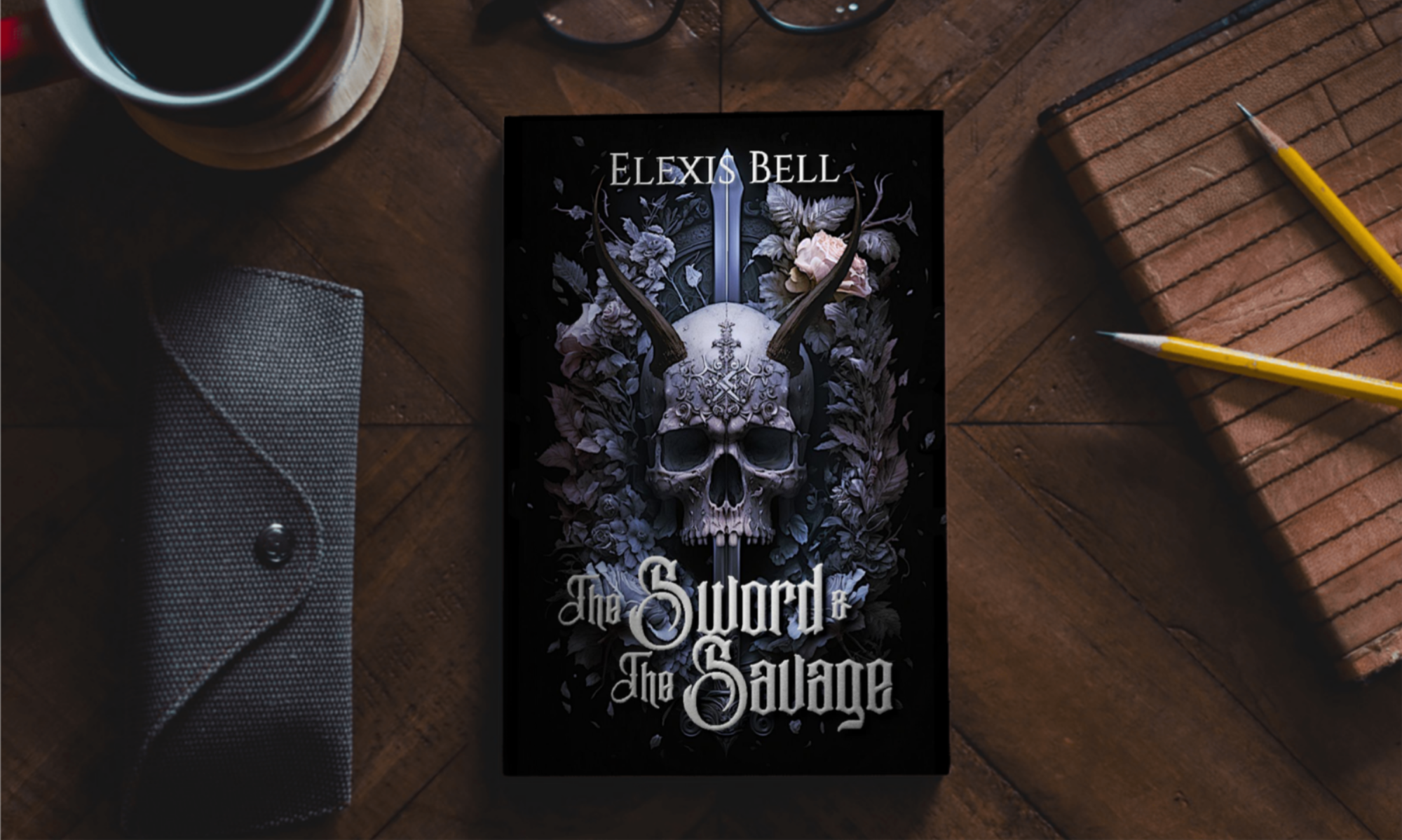
1. You don’t need a super fancy font.

I know, if you’re just starting out with graphic design, you might think you need all the curlicues and flourishes, or maybe a drippy font to look like blood if you write horror. But you don’t.

You need a legible font.

If people can’t read it, they probably aren’t going to zoom in and stare at it trying to figure out what it says.

Look at big name books. The fonts are simple so people can read them easily. There might be a little thing added here and there, but not many. The super ornate, cheesy fonts don’t get a lot of air time.

It’s hard to go wrong with a good sans or serif font. There are tons of fonts within either of those types. Just search for either “sans” or “serif” in the fonts of whatever program you’re using.

If you’re stumped (because there are a ton of these fonts), do a Google search to see what’s commonly used in your genre.

Some genres use a secondary font to make one word in the title pop, but for the most part, try to limit your fonts to one or two.

2. There is absolutely nothing wrong with black, white, or gray/silver text.

You don’t have to color match your text to your cover. Your main goal is to have that text be as readable as possible while still looking appropriate for the cover. The colors mentioned above are great for that.

And while we’re on this topic, avoid using one color for this and another color for that and a third color for something else and a fourth and a fifth…

Some genres use a bold color (or a cursive font, as mentioned above) to make one word in the title pop, but for the most part, try to limit your font colors to one, maybe two.

3. Center your text.

There are occasions where off-center text can help balance the composition of the art on the cover (a thing that we’ll get into when we talk about artwork), but the vast majority of the time, it should be centered.

4. Don’t be afraid to take up some real estate with your name and title.

Don’t squash all the words down, hiding them in a corner to show nothing but that art. Yes, the art is important, but that’s not what people are going to type into a search bar to find your book.

They’re not going to go tell their book lover friend, “Hey, you should read that book with the dragon on it.” And if they do, their friend is probably never going to be able to find your book.

The title and author name should be easy to read, and since the thumbnail of your book is the thing they’re most likely to see, that means the words need to be big enough to read even if the cover is shown at a small size.

Especially your author name.

If someone searches for your book title, awesome, they find your book. If they search for your name, they find ALL your books.

And for people who have read your work before, seeing your name might be all it takes to get them to buy another book.

But let me put it simply.

How do you expect to take up space in the market if you don’t even take up space on your own cover?

5. Big text means partially covering your artwork, and that’s okay.

People will still see that beautiful piece of art. The text isn’t likely to be big block letters that cover everything. And if it is, you can always play with transparencies to show the image through the text.

Just don’t do that with a really spindly font.

Now, with these tips in mind, review whatever cover you’ve created for your book. As with every art form, these are, of course, guidelines more so than rules. Every one of these things has its exception.

But they’re good guides to follow.

If you’re ever in doubt, get feedback from other authors, artists, and book lovers. And please, go into the feedback process expecting negative and positive feedback, ready to learn and improve and grow.

Come back next week for some tips about the artwork behind the typography.

Don’t forget to subscribe to stay up to date on all my books, releases, and giveaways. I send my newsletter out every Monday with exclusive content and sneak peeks, and there’s a free short story ready for download on sign-up.

Keep reading. Keep writing.

Later.