How to Design a Book Cover: Part Three, Design Basics

Now that you have some basic knowledge of typography and some resources to pick and choose images from, lets talk about the art itself.

There are a lot of things that come into play when creating art, and the rules and practices change depending on the medium and the style you’re working within. There’s a reason it takes many people years of study to become proficient in any artform.

Today, we’re going to cover a few basics. But first, the most important thing to remember is that your cover needs to do a couple very specific things. It needs to get (good) attention, it needs to convey something about your book, and it needs to fit the genre of your book.

So, with those things in mind, here are some things to remember while selecting artwork:

Composition

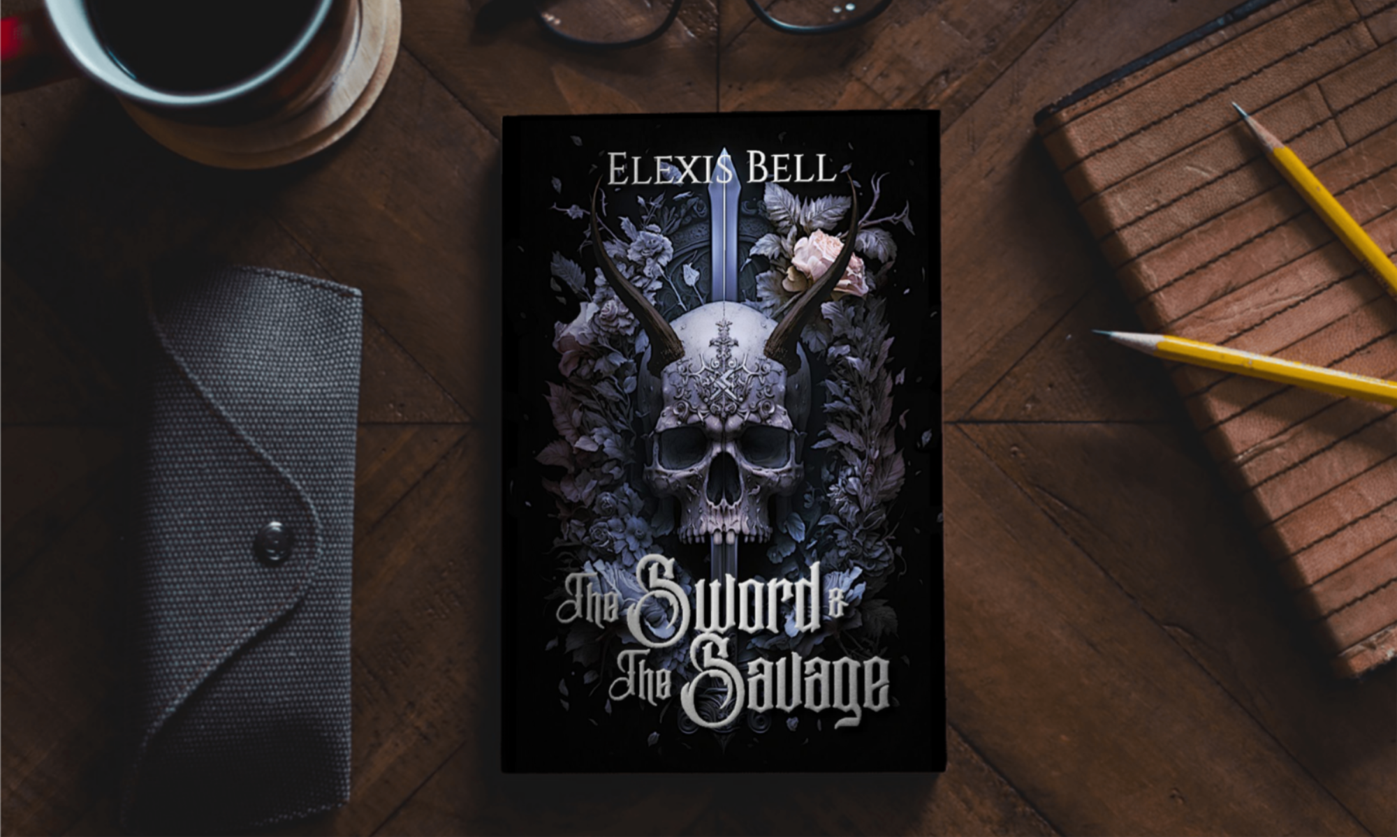
A good composition will have a defined focal point. You don’t want your cover to have so much going on that it loses all focus. Then, you run the risk of confusing readers or just flat out scaring them away.

You can use leading lines to direct the viewer’s eyes to certain areas of the cover. These can be a sword or a sweep of hair or a lifted arm. You can use these leading lines to show the viewer around the cover or direct them to the focal point.

Odd numbers of items/people and ‘S’ curves are very appealing in compositions.

Color scheme

Do you need a color scheme? Yes.

Your cover should be cohesive. If you have clashing colors and no discernible reason for those colors to be there, you’ll only scare readers away.

Pick a few colors that work together and stick with them.

Eye-catching

The entire point of a cover is to draw readers in. Thus, it needs to catch their eye.

You don’t need a massive landscape shrunk to fit on the cover. You don’t have to have explosions and boobs.

You need something that is aesthetically pleasing, something that stands out.

Genre appropriate

And yet, your cover needs to fit in.

Every genre has trends. Sometimes it’s okay to break from trends, but they do happen for a reason. They show what readers expect from that genre and helps a reader easily identify what kind of book they’re looking at.

Study other books in your genre to get ideas of the current trends.

Relevancy

Your cover should tell potential readers something about your book specifically so they have an idea of what they’re getting into.

If you have a dragon on your cover, they know to expect a dragon in the story. If you have a sword and some magical effects, they know to expect a sword and sorcery type book.

If your cover has a bloody knife on the beach, they know to expect a summer murder story.

Make sure your story gives a hint at what they’ll find within the pages. Just don’t beat yourself up trying to get the whole story onto the cover. Again, you don’t want the cover to become overwhelming or confusing.

Lighting

If you’re combining different images, you need to make sure the lighting is the same in each one. The images will have their own light sources within them, coming from their own directions.

You need to flip the various elements to align these light sources, otherwise you might end up with a character whose boobs are lit from one direction, the highlights on their wings are on the wrong side, and their shadow goes a completely different direction.

And that just doesn’t look right.

You may even have to adjust the lighting and shadows manually in photo editing software.

Aspect Ratio

Don’t squish an image to fit it onto your cover. It will be obvious. And it will look terrible.

Borders

Please, don’t.

The picture already has a natural border. It’s called the edge of the cover.

Use all the space you have available on that cover. It’s your first attempt to draw a reader in. It’s a major marketing tool.

Why waste it with a border?

Of course, as with any artform, rules and advice are more like guidelines. Professionals can break any rule if they have sufficient reason and do it in a way that comes across as very intentional. It just takes a lot of skill and work to get it to work.

So, one of the most important things to do when designing a cover is to get feedback. From authors. From readers. From artists. Seek feedback, and listen. Make changes as necessary.

Don’t forget to sign up for my newsletter here to stay up to date on all my books and get sneak peeks at my own covers and character art. Come back next week for more writing related tips and tricks.

Keep reading. Keep writing.

Later.

How to Design a Book Cover: Part Two, Resources

For those of you tuning in for the first time, I want to reiterate. A professional graphic designer is almost always the best option for your book cover. But some budgets just don’t allow for it, and believe me, I understand that.

So, for those of you who either can’t afford a pro or just want to make your covers yourself and don’t care if it’s advised against, I want to share some tips to help you do it just a little bit better.

I also want to start by saying that I am not an expert. Just an author with a background in art who’s made some mistakes and learned from them.

Last week, we discussed typography, an incredibly important, often underestimated part of the cover, so don’t forget to check that out next. This week, we’re talking about that beauty that goes behind the words.

The artwork.

You need good artwork. High resolution images, no watermarks. (Please pay for the art if it isn’t free. Don’t steal it or crop the watermark out.)

Please do not draw something by hand and then scan it into your computer. Your hand drawn art may be beautiful, but it isn’t the best medium for a book cover.

Please don’t jump into Microsoft Paint and just draw random things.

If you don’t have extensive experience with graphic design, your best bet is to find professional artwork. There are plenty of sites with gorgeous artwork available for commercial use for little to no money, and today, I’m going to list a few resources.

Canva
Great for sourcing free and paid images and illustrations.
Free and paid versions available.
Get started here.

Pexels
Tons of free images, videos, and vectors.
Option to donate to the artist to help support them.
Get started here.

Pixabay
Tons of free images, videos, and vectors.
Option to donate to the artist to help support them.
Get started here.

Artbreeder
Great for making landscapes, portraits, people, and creatures.
Commercial use allowed because you’re the one “creating” the artwork.
Takes some playing around to learn how to properly use it.
Free and paid versions available.
Get started here.

Now, for those with a little more experience, there are renders. You can buy bits and pieces, characters, props, backgrounds, and creatures. They do have to be pieced together in photo editing software to form a full image, so it requires a bit of knowledge with graphic design to get the lighting and layering correct.

Here’s my two favorite render sites:

The Render Shop
Wide variety of renders for every genre with more available almost every day.
Diverse and inclusive characters.
Freebie Friday.
Special things available to members of their Facebook group.
Get started here.

Sleepy Fox Studios
Diverse and inclusive characters.
Get started here.

All of these are great sources for artwork. Some require work to put them together (namely the renders), but all have the potential to help you produce a good cover.

Go forth and explore. Take some time to get ideas and play around. I’ll be back next Monday with a blog about picking appropriate images for your story.

Don’t forget to check out last week’s blog here to learn about the text that goes on the cover.

If you like gritty stories with lots of character development, sign up for my newsletter here to get a free short story and stay up to date on all my books.

How to Design a Book Cover: Part One, Typography

We all know that a professional graphic designer is almost always the best option for your book cover. But some budgets just don’t allow for it, and believe me, I understand that.

So, for those of you who either can’t afford a pro or just want to make your covers yourself and don’t care if it’s advised against, I want to share some tips to help you do it just a little bit better.

Now, let me start by saying that I am not an expert. Just an author with a background in art who’s made some mistakes and learned from them.

So, I’ll be doing a two part blog series all about book cover design.

First and foremost, we need to talk about typography.

You might be wondering why I’m not starting with the images behind the text, because after all, it’s just text on the cover. The picture is all that really matters, right?

No. The words on the cover, their placement, the font, the size, the color, all of these things are incredibly important.

You cannot just slap some text on your cover and call it done. Bad typography can ruin a cover, even if you have a beautiful piece of art behind it. When you get it right, it can make a world of difference.

Since typography is so often underestimated, that’s where we’re starting. So, let’s dive in.

1. You don’t need a super fancy font.

I know, if you’re just starting out with graphic design, you might think you need all the curlicues and flourishes, or maybe a drippy font to look like blood if you write horror. But you don’t.

You need a legible font.

If people can’t read it, they probably aren’t going to zoom in and stare at it trying to figure out what it says.

Look at big name books. The fonts are simple so people can read them easily. There might be a little thing added here and there, but not many. The super ornate, cheesy fonts don’t get a lot of air time.

It’s hard to go wrong with a good sans or serif font. There are tons of fonts within either of those types. Just search for either “sans” or “serif” in the fonts of whatever program you’re using.

If you’re stumped (because there are a ton of these fonts), do a Google search to see what’s commonly used in your genre.

Some genres use a secondary font to make one word in the title pop, but for the most part, try to limit your fonts to one or two.

2. There is absolutely nothing wrong with black, white, or gray/silver text.

You don’t have to color match your text to your cover. Your main goal is to have that text be as readable as possible while still looking appropriate for the cover. The colors mentioned above are great for that.

And while we’re on this topic, avoid using one color for this and another color for that and a third color for something else and a fourth and a fifth…

Some genres use a bold color (or a cursive font, as mentioned above) to make one word in the title pop, but for the most part, try to limit your font colors to one, maybe two.

3. Center your text.

There are occasions where off-center text can help balance the composition of the art on the cover (a thing that we’ll get into when we talk about artwork), but the vast majority of the time, it should be centered.

4. Don’t be afraid to take up some real estate with your name and title.

Don’t squash all the words down, hiding them in a corner to show nothing but that art. Yes, the art is important, but that’s not what people are going to type into a search bar to find your book.

They’re not going to go tell their book lover friend, “Hey, you should read that book with the dragon on it.” And if they do, their friend is probably never going to be able to find your book.

The title and author name should be easy to read, and since the thumbnail of your book is the thing they’re most likely to see, that means the words need to be big enough to read even if the cover is shown at a small size.

Especially your author name.

If someone searches for your book title, awesome, they find your book. If they search for your name, they find ALL your books.

And for people who have read your work before, seeing your name might be all it takes to get them to buy another book.

But let me put it simply.

How do you expect to take up space in the market if you don’t even take up space on your own cover?

5. Big text means partially covering your artwork, and that’s okay.

People will still see that beautiful piece of art. The text isn’t likely to be big block letters that cover everything. And if it is, you can always play with transparencies to show the image through the text.

Just don’t do that with a really spindly font.

Now, with these tips in mind, review whatever cover you’ve created for your book. As with every art form, these are, of course, guidelines more so than rules. Every one of these things has its exception.

But they’re good guides to follow.

If you’re ever in doubt, get feedback from other authors, artists, and book lovers. And please, go into the feedback process expecting negative and positive feedback, ready to learn and improve and grow.

Come back next week for some tips about the artwork behind the typography.

Don’t forget to subscribe to stay up to date on all my books, releases, and giveaways. I send my newsletter out every Monday with exclusive content and sneak peeks, and there’s a free short story ready for download on sign-up.

Keep reading. Keep writing.

Later.