Picking a font can be daunting. There are about a million to choose from, and it’s important. So where to start?
Maybe by narrowing it down.
There are some fonts that are more common in certain genres or in certain age groups, so you should probably do some research to see what other books like yours are being printed in.
But you should also take into account what step in the process you’re at.
Writing:
Anything that helps you get it written works. You can use Wing Dingz, as long as it helps you finish the book.
Side note: There’s a rumor that writing with the font Comic Sans will help write faster.
Querying/Submitting:
Abide by the guidelines each publisher or agent has set forth on their website.
Publishing:
Traditional publishers likely make this decision.
Self-publishing means it’s up to you and your formatter. Times New Roman is common. Garamond (a personal favorite) and Palatino are nice.
There are fonts available that help with dyslexia, as well as one called Dyslexie that was specifically designed to help people with that disorder. So, if you’re writing books specifically for people with Dyslexia, that might be something to consider.
Basically, there are a lot of options and variables to consider, even just within the realm of serif and sans fonts (where you should likely start because those types tend to be easy to digest). There’s no hard and fast rule. But there are common fonts, the most prevalent being Times New Roman.
But unless you’re self-publishing, it isn’t really something you need to worry about. And if you are, do some research to see if there are common fonts in your genre and pick one that you like, one that’s easy to read.
Subscribe for sneak peeks and updates on my upcoming books (and get a free short story).
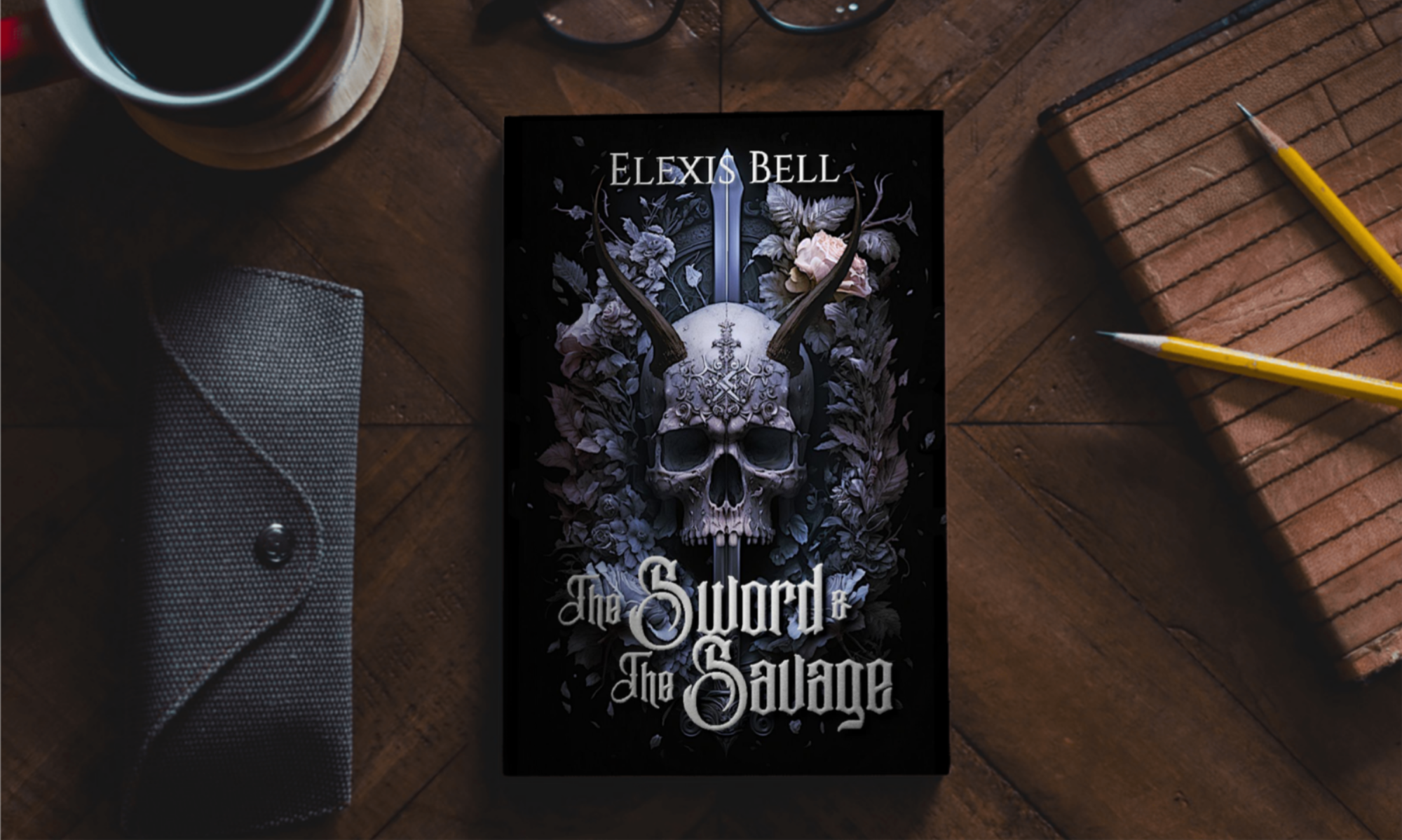
Check out my gritty, literary sci-fi and fantasy books here.
Find me on Goodreads.
Want to help fund this blog and my writing efforts? You can support me directly here.